InfoBox
InfoBox’s main challenge was designing a SaaS brandmark able to survive extreme reduction. We created a visual identity based on isometric geometry that fits into the Google Workspace ecosystem, staying legible at just 24 pixels.


Usage Context: 24px in the Gmail Sidebar
The Selection Process
We presented 4 distinct conceptual routes. Each proposal was evaluated not only for its large-format aesthetics, but for its performance and legibility when reduced to 24px in the Gmail sidebar.

Cubic volume exploration.

Flat shadows and frontal perspective.

Forced isometric perspective.

The chosen geometric base.
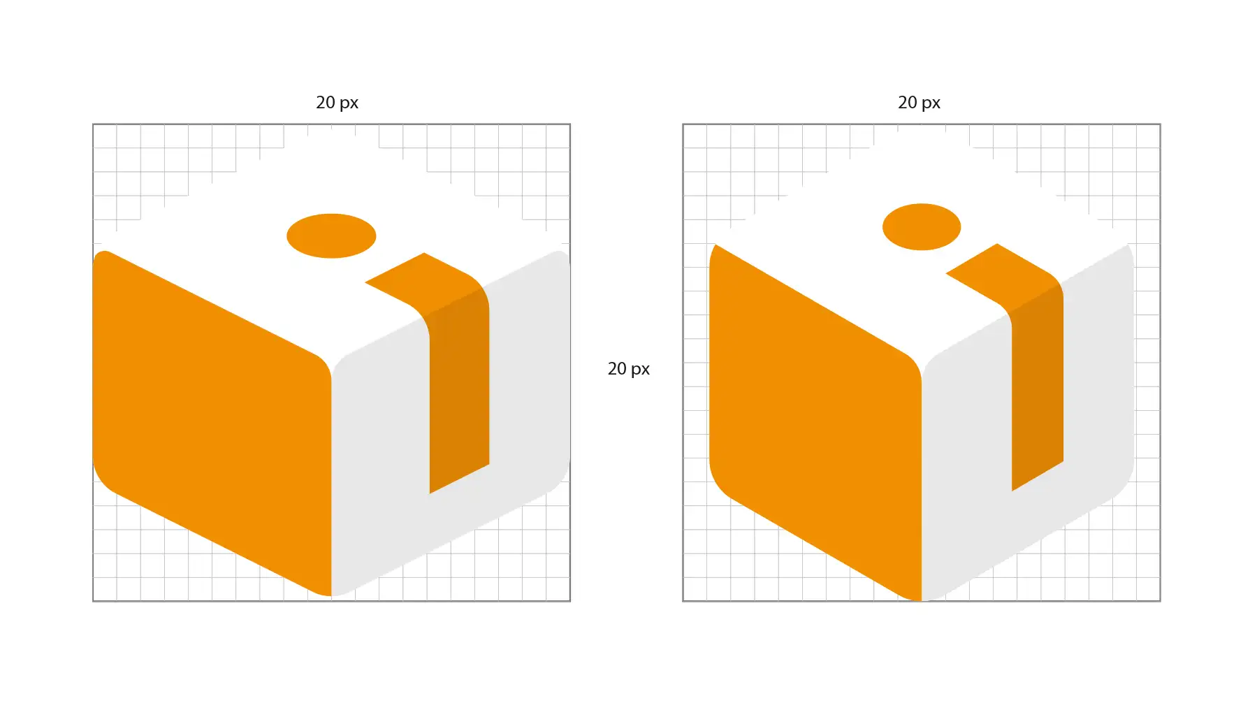
Isometric Study
To justify the final shape we ran a comparative study using two grid types. The goal: to ensure the icon not only looked good large, but survived the extreme reduction of the UI.

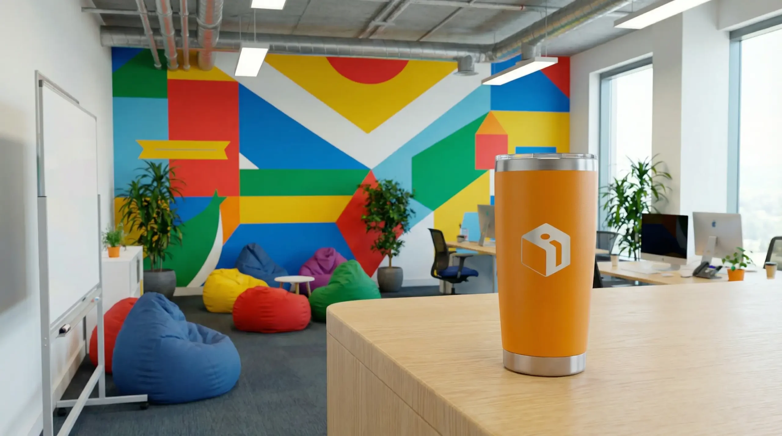
Merchandising & POP